Back to Insight
Research
How many prompts do you need to track AI visibility?

Mike Logue
SUMMARY
How many prompts do you need to track AI search visibility? A statistical breakdown of sample sizes, confidence intervals and tracking cadence - and why measuring topics rather than individual prompts cuts margin of error from ±16pp to ±3.7pp.

Every brand that starts tracking its visibility in AI search asks the same question: how many prompts is enough? It is a fair question and one which I get quite excited by given I (many moons ago) studied Statistics at university.
Large language models give probabilistic answers, so the same prompt asked twice can return a different set of brands. Run a query today and you appear. Run it tomorrow and you might not. That variability makes any single measurement close to meaningless.
The temptation is to treat this as a reliability problem and ask whether the same brands keep showing up for the same prompt. That is the wrong question. Nobody buys a tracking tool to learn whether one prompt is stable. The question worth answering is how much noise sits in the data, and how many prompts it takes to average that noise into a signal you can act on.
This article explores how we think about sample size at Obsero, and why the answer is more generous than many of the nay-sayers suggest.
Track topics, not prompts
Let's start with the unit of measurement, because a single prompt is the wrong one.
Take a prompt like “what are the best trainers for a first marathon?” Whether your brand appears in that answer this week tells you very little on its own. Even tracked daily across three models, that prompt produces only around 21 readings a week, and at a realistic visibility rate the margin of error on that score is roughly ±16pp. A number that can swing 16 points in either direction is not a metric. It is noise.
The unit that matters is the topic. Group that marathon prompt with 15 or 20 others about running trainers and you have a topic-level visibility score. That topic-level score answers what brands actually care about: how visible are we when people ask AI about running trainers. It is also far steadier, because it averages across many prompts instead of betting on one. This mirrors how AI search works. In traditional search you could win by ranking first for one high-volume term. In AI search there is no position one to capture. Visibility comes from breadth, from showing up across a wide range of prompts which are relevant to your ICP. Breadth is therefore what you should measure
Sizing it commercially
Once you are measuring topics, how many prompts does a topic need? This is a standard sample-size question, and it has a standard formula.
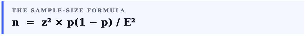
Here p is the expected visibility rate, E is the margin of error you are willing to accept and z reflects your confidence level. Two of those inputs are routinely set far too conservatively.
The first is p. When the true rate is unknown, textbooks tell you to assume the worst case of 0.5, because that maximises the required sample. That is the right call for a clinical trial. It is the wrong call for a marketing dashboard. Assuming 0.5 inflates the prompt count for no commercial gain. A more realistic p of 0.3 reflects what visibility rates actually look like for a tracked brand inside a defined topic, and it is still a cautious choice.
The second is confidence. A 95% confidence interval is the academic default. For a commercial visibility metric, 90% is ample. You are not approving a drug. You are deciding whether a topic is trending up or down. The extra certainty of 95% costs roughly 40% more prompts and buys nothing you will use.
Change those two inputs from the statistician’s worst case to a commercial balance and the requirement looks like this:
Margin of error | Prompts needed | Practical read |
|---|---|---|
±10pp | 57 | Broadly directional |
±5pp | 228 | Commercial standard |
±1pp | 5,682 | Academic precision |
At ±5pp the working number is around 228 prompts. That sounds like a lot. It is not, and the curve below shows why chasing more precision rarely pays off.
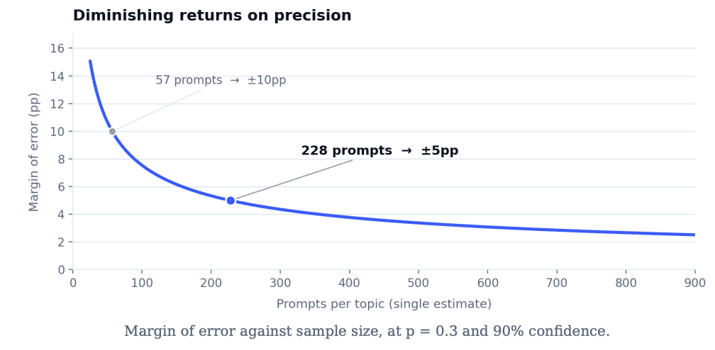
Accuracy improves with the square root of sample size, so every extra point of precision costs disproportionately more prompts. Around ±5pp the curve flattens. Pushing towards ±1pp means spending heavily for precision that no commercial decision needs.
The time series changes the maths
That figure of 228 assumes you take one measurement, once. Nobody tracks visibility that way. You track it continuously, and that changes everything.
A time series multiplies your effective sample in three directions at once. Every prompt runs across multiple models. Every prompt runs every day. And every week stacks another set of readings on top. You are not taking one snapshot of a topic. You are taking hundreds.
This is why you should read the trend, not the dot. Any single day’s reading carries noise. A line drawn through 30 days of readings does not. The signal you actually want, whether a topic is gaining or losing visibility, lives in the slope, and the slope is far steadier than any single point on it.
One caveat is worth stating plainly, because it is easy to get wrong. Comparing two individual weeks is noisier than it looks. The margin of error on a week-to-week change is wider than on a single week, nearer ±5pp on the example below, because you are comparing two uncertain numbers. A small week-onweek wobble is rarely meaningful. A sustained move over several weeks is. Trend beats snapshot, again.
What this means in practice
Put real numbers on it. Take a brand tracking 100 prompts across three models, refreshed daily, with those prompts grouped into five topics. That works out at 20 prompts a topic.
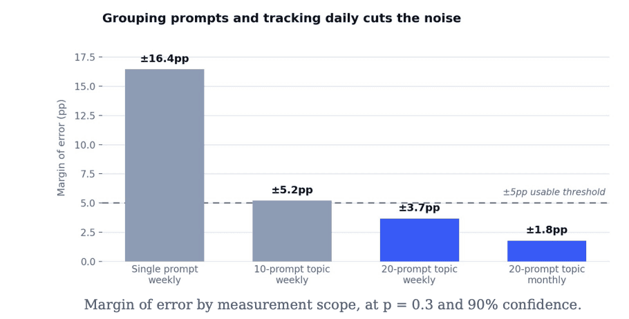
Each topic generates 20 prompts across three models every day, which is 420 readings a week. At p = 0.3 and 90% confidence that gives a weekly topic score with a margin of error around ±3.7pp. That is decision-grade, comfortably inside the ±5pp most teams treat as the threshold for a usable metric.
Over a month the same topic accumulates roughly 1,800 readings, which tightens the margin of error to about ±1.8pp. At that point the question is no longer whether the data is significant. It is how small a movement you want to detect.
The single prompt at the start of this article sat at ±16pp. The same prompts, grouped into a topic and tracked daily, deliver ±3.7pp weekly and ±1.8pp monthly. Nothing changed but the unit of measurement and the cadence.
Rules of thumb
For anyone setting up AI search visibility tracking, this is where it lands:
• Measure topics, not prompts. A single prompt is noise. A topic is a metric.
• Treat 15 to 20 prompts per topic as a floor. More helps, but the curve flattens quickly.
• Track across several models and run daily. Cadence is sample size, and it is the cheapest accuracy you can buy.
• Judge weekly reads for direction and monthly reads for precision. Both are useful. Neither is the whole picture on its own.
• Read the trend, not the dot. The slope is the signal. Individual points are not.
The worst-case statistics say you need thousands of prompts to measure AI visibility with confidence. With commercial assumptions and daily tracking, a well-structured 100-prompt programme already produces topic-level data that is comfortably significant week to week, and tight enough month to month to pick up small movements. The data is there. You just have to measure the right unit.
Growth through intelligence
Capture your brand’s historic visibility, recommendation and sentiment data from AI Search in one intuitive platform